Client
Aura Biosciences
—
Agency
Design & Co.
—
Services
Brand Identity
Brand Strategy
Print
Photography
Visualization
Illustration
—
Photography
Design & Co.
Aura Biosciences
—
Industry
Healthcare
Biosciences
Professional Services
Technology
Challenge
Aura develops novel oncology targeted therapies that can establish a new standard of care for cancer patients. The company's primary research focuses on ocular melanoma treatment, a rare and life-threatening disease. Ocular melanoma starts with a small melanocytic tumor in the back of the eye and can be difficult to detect. Patients with this disease have very few treatment options today. Treatment is severe and usually results in blindness. Aura hopes to radically change the therapy of this disease with its novel targeted therapies.
During this period, Aura was undergoing phase II clinical trials and rapidly expanding. The company needed to make its offerings more clear to patients, investors, and new employees.
Solution
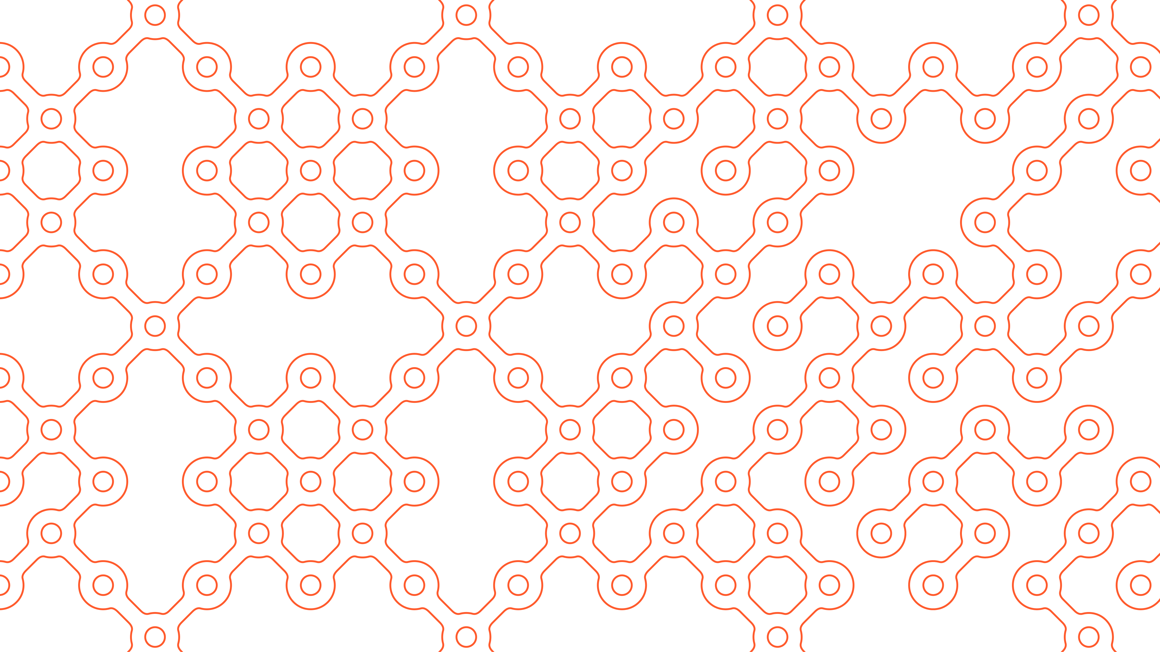
Working in collaboration with Design & Co., we created a dynamic brand identity that visualizes Aura's targeted therapies as a dynamic system of interconnected, protein-shaped receptacles.
In targeted therapy, drugs are used to target specific genes and proteins that are involved in the growth and mutation of cancer cells. These drugs target specific features of the cancer cell but have little effect on other cells. The new identity works in a similar manner. It starts with a single receptacle that can bind with others to create an endless combination of cellular configurations. Each configuration can function as a healthy or mutated protein. The system is capable of visualizing specific protein structures and binding methods involved in each therapy. Orange serves as the brand's core color and also conveys targeted changes within the network of grey cells.
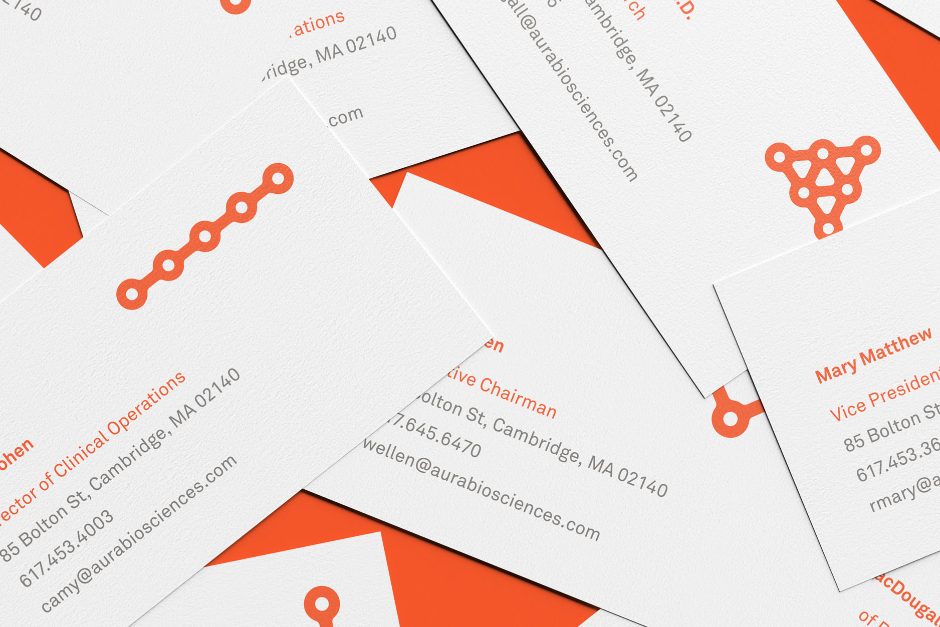
The identity system is extended to the design of the new website, brand style guide, and company collateral. As a way to make things more personal, a variety of gene and protein configurations were created and each employee was asked to choose their favorite for their business card. Completing the rebrand is a name change from Aura Biosciences to simply Aura. A new logo, set in a timeless Futura Bold, highlights the change.
Aura is currently completing phase II clinical trials and is on a direct path to a commercial drug launch. If successful, its therapy will be the first and only treatment of its kind.
Share
Twitter LinkedIn Facebook
We created a dynamic brand identity that visualizes Aura's targeted therapies as a dynamic system of interconnected, protein-shaped receptacles.
To make things personal, we created a variety of gene and protein configurations and asked each employee to choose their favorite on their business card.
Related
Let’s talk!
info@studiopiko.com
+1 339 927 0405
